Slightly Bad Infographics, #1
I probably shouldn’t pick on Vox for my very first rant, but this entry bothered me a bit. It shows the number of deaths per outbreak (roughy categorized by year). But, a) time is on the Y-axis, which is a bit odd, and b) the Y-axis is treated as a categorical variable.
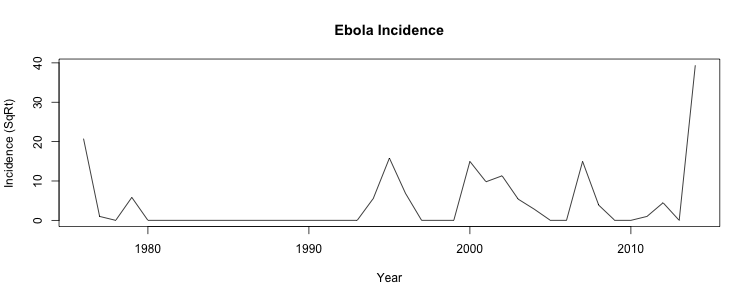
Here’s a slightly revised version, where year is on the X axis, and I’m treating it as a continuous variable. What jumps out at me is how Ebola has become a lot more common in the past 15 years or so. (I’ve also taken the square root of the incidence rate; without it, the 2014 outbreak dominates the graph.)
I am wondering what changes in culture / society happened to make Ebola so much more common.